SPARC and the Center for Innovation brought together physicians with designers, an unlikely marriage that could produce at some times excitement and at other times confusion.
Physicians were deeply guided by tradition, and because they bore the responsibility for the patient's life and well-being, they were as a group risk-averse. Physicians were scientists who needed to see data and proof before trying something new. This conservative culture affected doctors' willingness to try not only new drugs and treatments but also new administrative procedures and educational methods.
Designers, on the other hand, operated in a more qualitative world. They experimented freely and preferred "rapid prototyping" to careful proof. They wished to see their ideas applied in real-world settings, but they shared with fine artists a love of creativity and risk-taking.
CFI staff from both cultures admitted that they faced challenges in communicating with each other, but they also believed that it was the differences that enabled innovation. "It's a match made in heaven," said one physician.
Today is the first annual Customer Experience Day! There’s a growing number of professionals who are dedicated to making great customer experiences — and today is a day to celebrate their work. Today I’d also like to celebrate the role of design in helping customer experience (CX) pros create those experiences. It's not graphic design, interior design, or industrial design — but the lesser-known field of service design. You may not have heard of service design yet, but I’d argue that it’s the most important design subspecialty in the business world today.
What is service design? Its purview includes the design of interactions that span time and multiple touchpoints. Service design is sometimes easiest to grasp when contrasted with product design. Product designers create tangible things: tennis shoes, teapots, and tablet computers. Service designers create intangible experiences: the series of interactions that you have as you book a flight, pay a bill, get a driver’s license, or go to the doctor. Service designers also design the behind-the-scenes activities that enable those experiences to be delivered as planned.
I hope you can see from the description above why service design is critical to customer experience. So why is service design such an obscure field? Andy Polaine, Lavrans Løvlie, and Ben Reason sum it up nicely in their book Service Design: From Insight To Implementation — “It is because many services are almost invisible that nobody takes care to design them.” Indeed, it’s obvious that tennis shoes, teapots, and tablets need to be designed. Yet many CX pros skip directly to managing the customer experience via measurement and governance programs — and give little thought to actively designingexperiences in the first place. In fact, Forrester recently surveyed 100 customer experience professionals and found that only 15% consistently follow a defined customer experience design process when they create new interactions or improve existing ones.
So why is service design so important? We’ve entered a new business era that Forrester calls the age of the customer — a time when focus on the customer matters more than any other strategic imperative. Service design provides a toolset and framework that enable companies to truly understand their customers and engage with them in meaningful ways — ultimately driving profits, cost savings, and competitive differentiation.
If you’d like to learn more about service design, I’d encourage you to check out some of my previous blog posts:
I’d also encourage you to attend a service design or customer experience conference where you can dig deeper and connect with the design community. I’ll be speaking at:
Don Norman is an anthropologist of modern life, studying the way we humans interact with our designed world. Though he has a slight reputation as a grumpy critic, his work is generous and insightful -- he wants nothing less than to close the gap between products and their users. If you've ever fought with an automatic faucet in an airport bathroom, or wondered which button to press in the anonymous row on top of your printer, it's good to know that Norman is in your corner. He's the author of a raft of books on design and the way we humans interact with it, including the classic "Design of Everyday Things." His next book, says his website, will be aboutsociable design.
Norman began his career as an academic, working in psychology and then cognitive science at UCSD. In the mid-'90s, he joined Apple and ended up in their Advanced Technology Group, and later worked for HP, before returning to university life. He's now the co-director of an innovative combined MBA and MEM program (called MMM) at Northwestern University. He's also a cofounder of the usability consultancy Nielsen Norman Group.
cAir (pronounced “care”) is a service design concept that eases the burden of air travel for families, making the journey more enjoyable for everyone. A proactive initiative by the strategic design consultancy RKS, cAir was a venture built organically from the ground up. They architected a new flying experience based on the real-life challenges of family travelers, a stark departure and inspiration for an industry traditionally focused on efficiency.
ON THE 50TH ANNIVERSARY OF JOSEF ALBERS’S INTERACTION OF COLOR, YALE UNIVERSITY PRESS HAS RELEASED THE WORK AS AN INTERACTIVE TEACHING TOOL ALONG THE LINES OF WHAT THE BAUHAUS MASTER ORIGINALLY INTENDED.
Josef Albers, one of the best-known painters and educators to emerge from the German Bauhaus, wrote Interaction of Color in 1963, and it’s remained an art and design bible ever since. Last week, to commemorate the book’s 50th anniversary, Yale University Press released the Interaction of Color app for the iPad, a modernized, interactive presentation of Albers’s teachings. With fingers instead of paintbrushes and a touch screen instead of paper, users can move and manipulate over 125 color plates in 60 interactive studies. Concepts like color relativity and vibrating boundaries come to life in this $9.99 app, alongside the book’s full text and two hours of video footage.
Michelle Komie, senior editor for art and architecture at Yale University Press, tells Co.Design that the app’s developers at design firm Potion first “used paper, scissors, and glue to complete the exercises as Albers’s students would have done, in order to experience Albers’s process and methodology.” The text was then meticulously translated into app form--they even preserved his original typeface and text columns.
“Potion created one of the most beautiful color selecting tools I’ve ever seen,” Komie says. “The circle of swatches brings an elegant tactility to the screen, which becomes a workspace that can be littered with trials and errors; where swatches can be adjusted, swapped out, and exchanged." This makes the work process “both beautiful and efficient--true Bauhaus qualities of which we think Josef Albers would be proud.”
Best known for his abstract paintings and theory, Albers was also an accomplished printmaker, photographer, typographer, and poet. At the Bauhaus, he often worked in stained glass, sometimes using detritus from the Weimar town dump. After the Nazis shut down the Bauhaus in 1933, Albers moved to the States and eventually became chair of the Yale Art Department, where his students included artists like Eva Hesse and Robert Rauschenberg.
The new app takes his methods beyond the Ivory Tower. Says Komie, “The original 1963 edition of Interaction of Color is an object that very few people will ever have the chance to view and experience. It mostly lives in university and museum special collections. But Albers always intended it to be used as a teaching tool: he wanted its folios spread out on a table, and looked at alongside the text and commentary. This is something that is very difficult to do with a traditional book, which provides a linear experience. The app accomplishes what Josef Albers originally intended.”
Albers stated his belief that “exercises toward distinct color effects never are done or over. New and different cases will be discovered time and again.” This new and different iteration of his theories adds dimension and interactivity for the digital age, sparking just the kind of discoveries that fueled his life’s work.
Alexander Chen is a 32-year-old digital-media designer and musician. As a Creative Director at Google Creative Lab in New York and a member of the Google Glass design team, he was the leader of the pioneering group whose task was to imagine what the Glass user interface might look like and how it could be used in our everyday lives (resulting in the famous concept video for Google Glass in 2012). He is also the man behind the viral Google Doodle tribute to musician Les Paul, released on June 9th, 2011 – whereby the Google logo, transformed into an interactive digital guitar, allowed people to play, record and share music online.
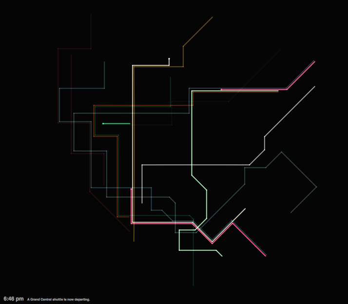
Another celebrated project by Chen is the online app Conductor (2011). It is both a generative music piece and an interactive digital instrument, inspired by the New York City subway: the time tables, routes and travelling distances of the underground trains are used as data that define musical parameters, while the visual layout is inspired by designer Massimo Vignelli’s 1972 subway system map. All this playfully transforms New Yorkers’ mundane commute into an interactive musical application – a digital harp shaped as a metro system – that can be played by using one’s mouse. It can be accessed online atwww.mta.me.
String instruments seem to be a fixture in Chen’s work which we discovered during his talk at the Design Indaba Conference 2013 in Cape Town, South Africa. Apart from his colourful pizzicato take on New York City’s subway, and the Google doodle guitar, he’s also designed Baroque.me, a harmonious visualisation of the prelude from J. S. Bach’s famous First Cello Suite. As another interactive online application, which adds to the appreciation of the musical structure by visualising it in an instructive way, the app creates a clever poetic metaphor of order and chaos, where the music turns into nonsense when disturbed by the user, slowly returning to its harmonious flow when left untouched.